Deliveroo
Building brand at unicorn speed
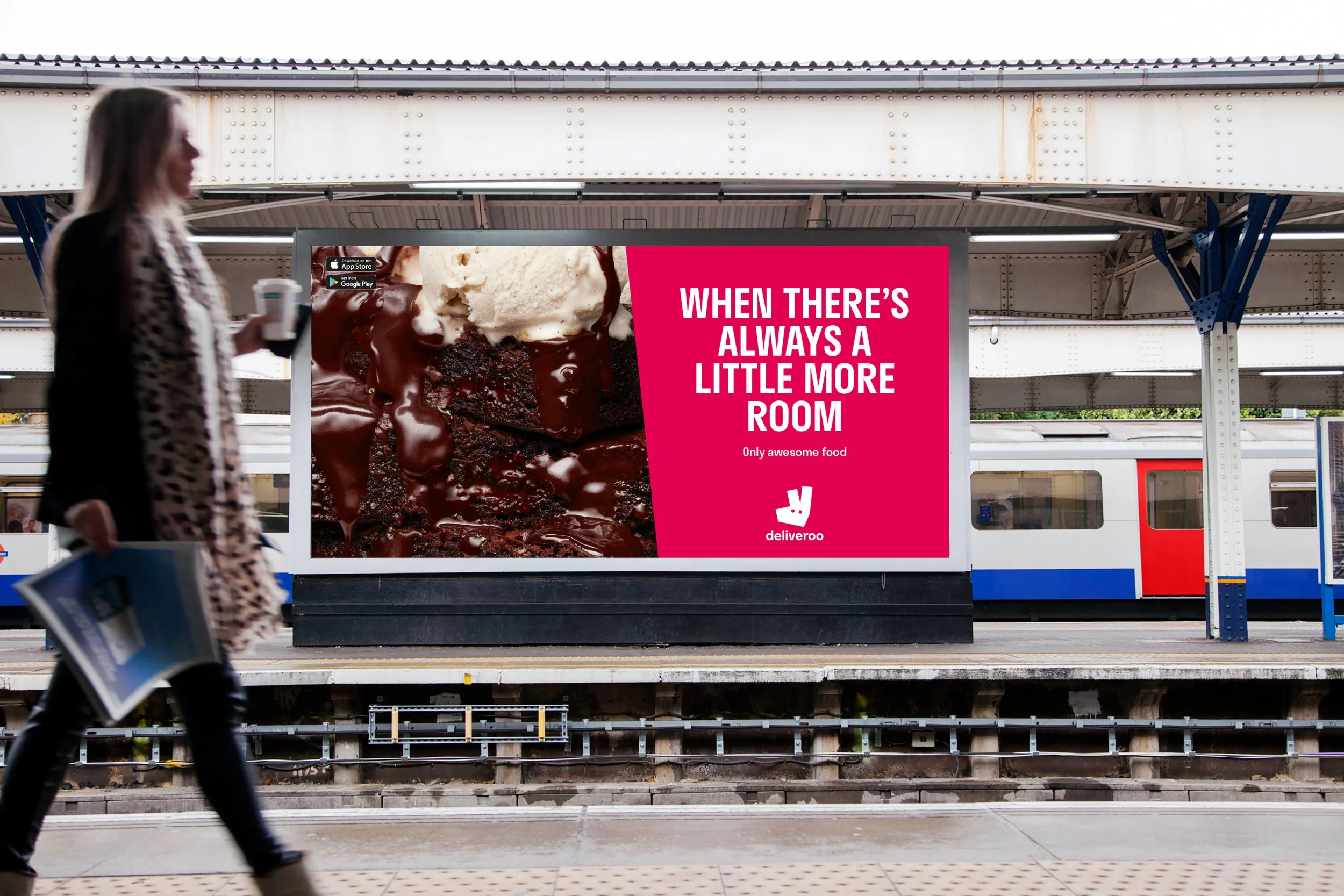
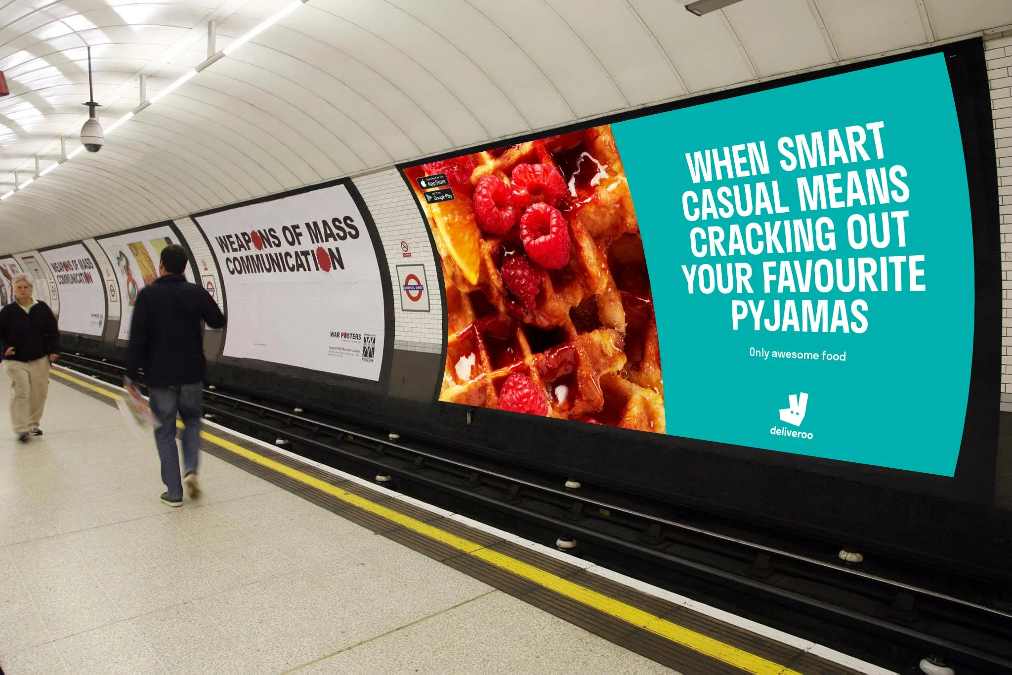
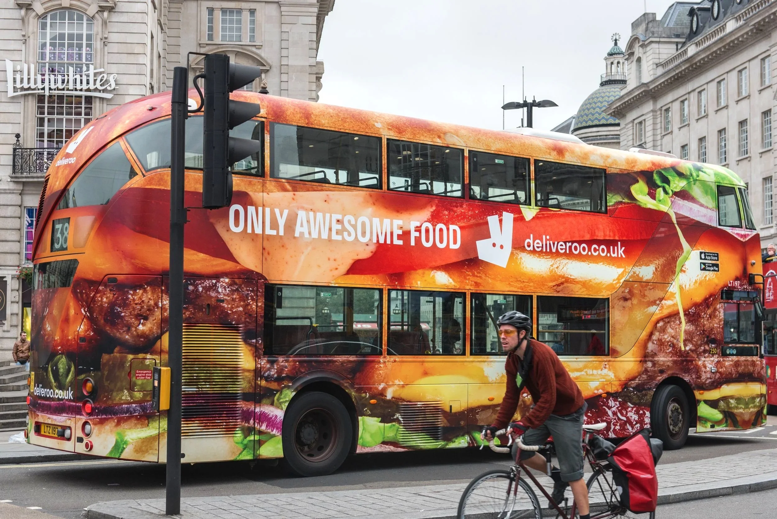
Deliveroo was scaling fast: new countries, new teams, new commercial challenges and a rebrand happening while the business kept moving.
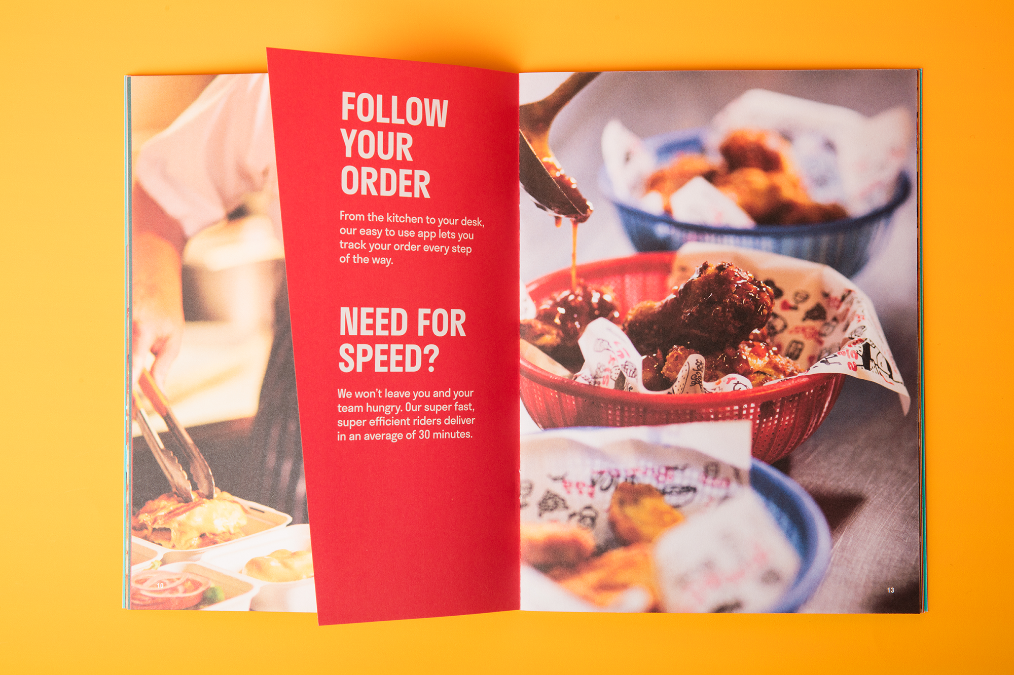
I spent around half my time on the core brand, working closely with the Creative Director across rebrand rollout, country marketing, photoshoots, events and campaigns across APAC and EMEA. The other half was all about Deliveroo Editions; the project I owned most fully; turning delivery-only kitchens into food envy.
Role Designer to Lead Designer: Deliveroo Editions
Scope Global rollout | Sub-brand identity | Site design | Launch playbooks | Events | Country marketing | Art direction
Partners Growth | Product | Food development | Agencies | Exec
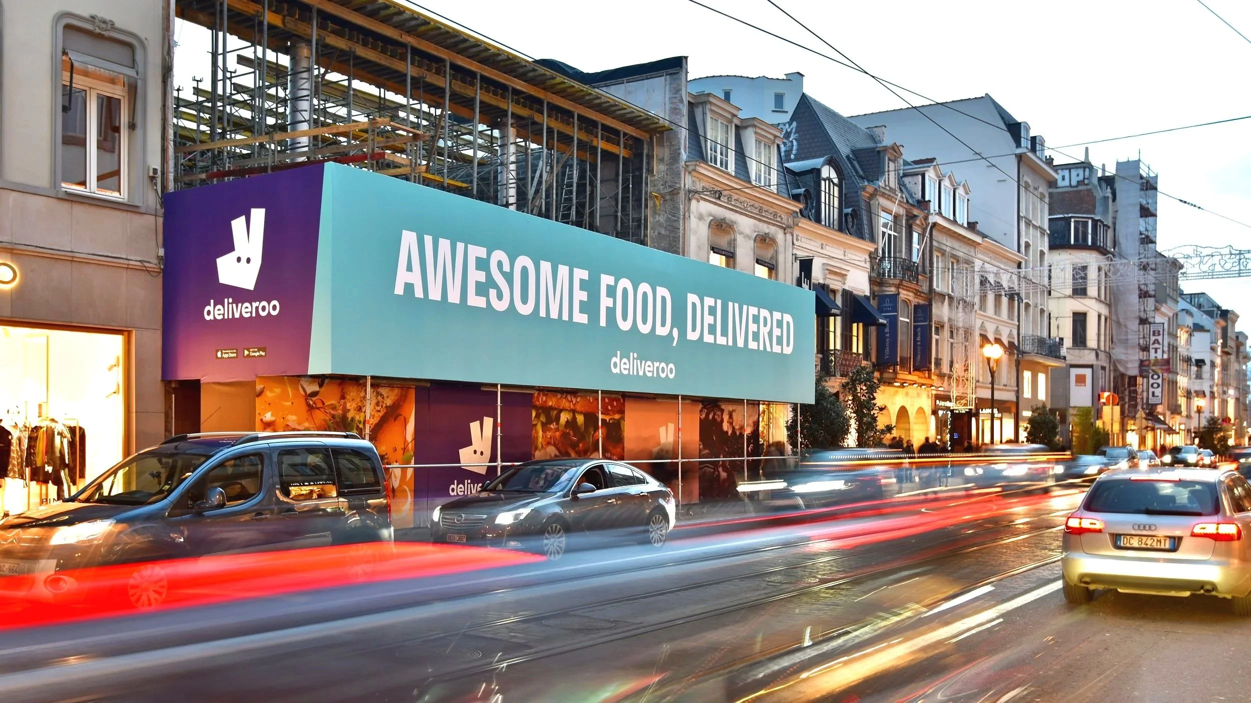
Highlights Deliveroo Rebrand Roll out | Launching Deliveroo Editions | Local artist collaborations | Winter OOH across UK and international markets
Scaling the core brand
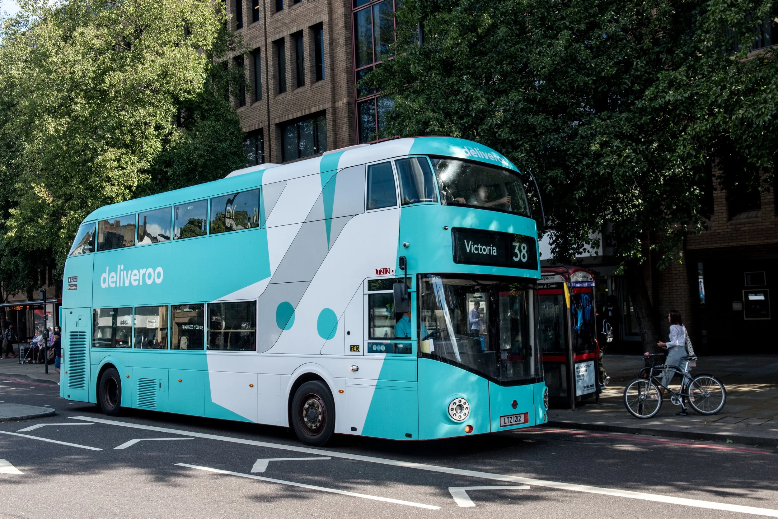
Deliveroo was was a baptism of fire in the best way. In my first two weeks we launched 6 new global markets, to become 12 by the time I left, and the pace never slowed down.
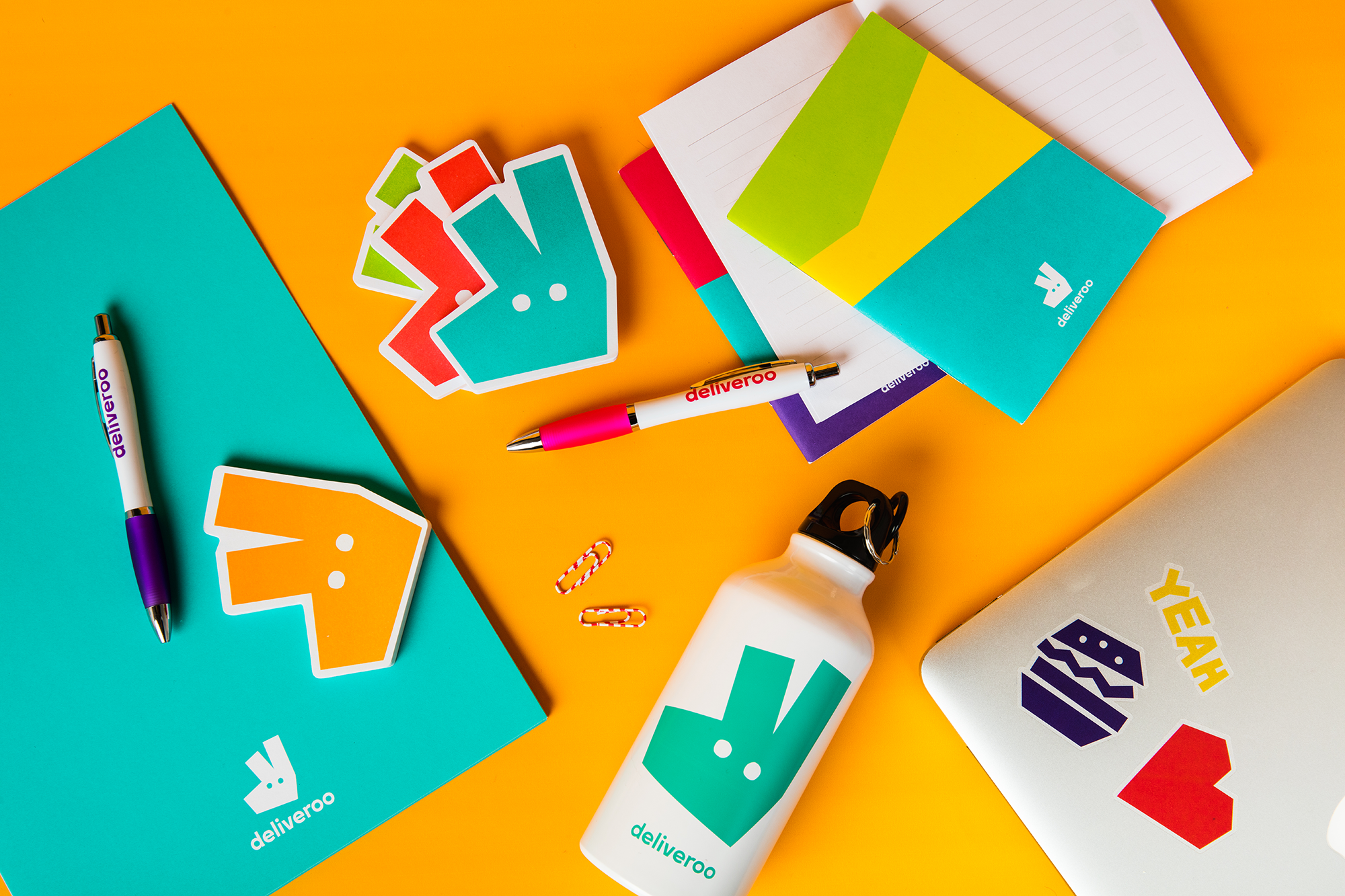
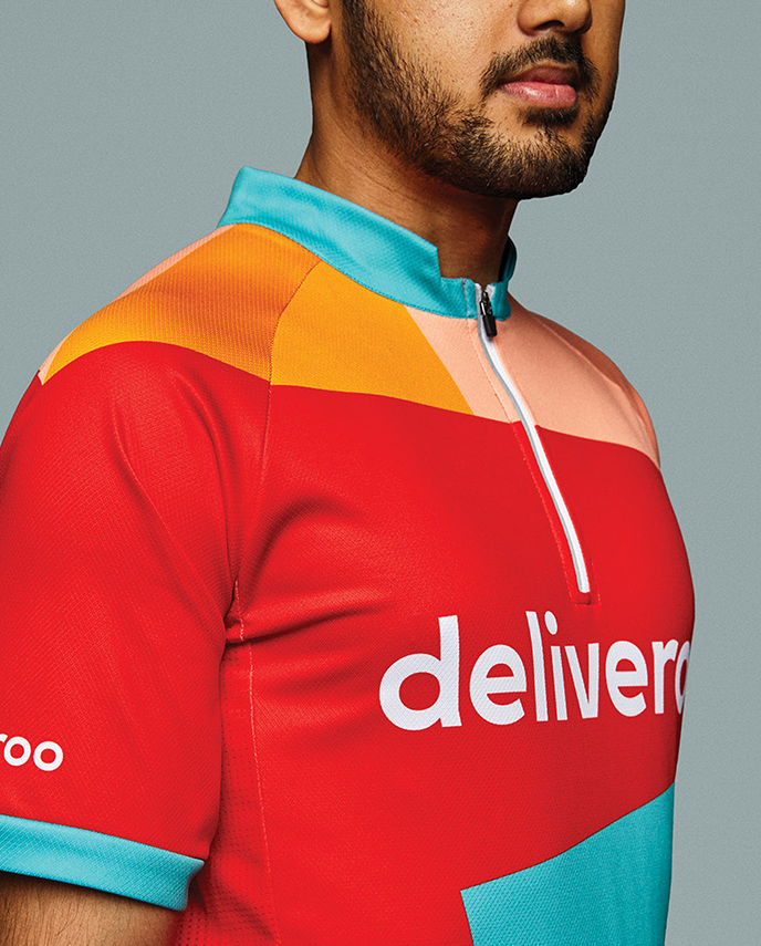
I was a key part of feeding back on, and rolling out the rebrand with Design Studio (now Further) and got the best of the startup experience of being thrown in at the deep end.
At Deliveroo I learned how quickly a brand system has to flex in a fast-growth business. I owe so much of my skillset to what I learned there, from some of the sharpest minds I have worked with.

Defining the sub-brand
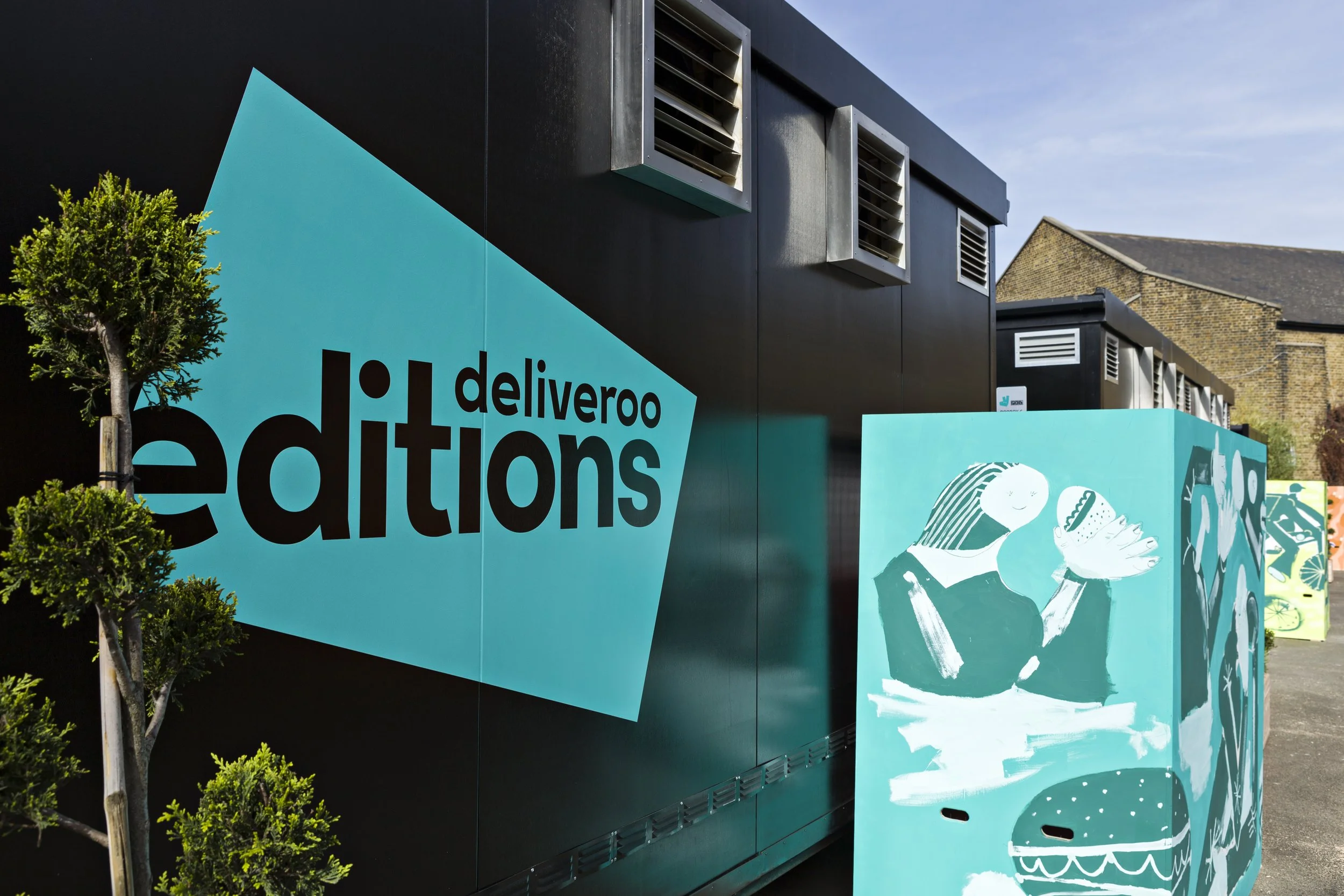
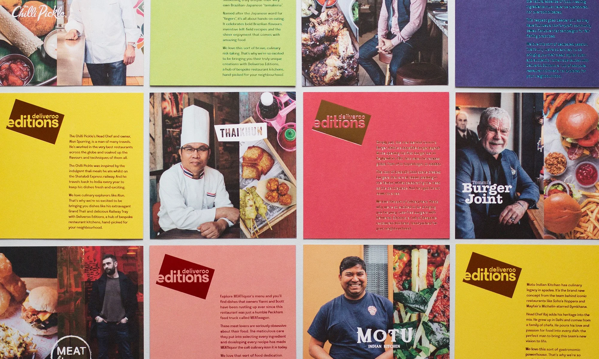
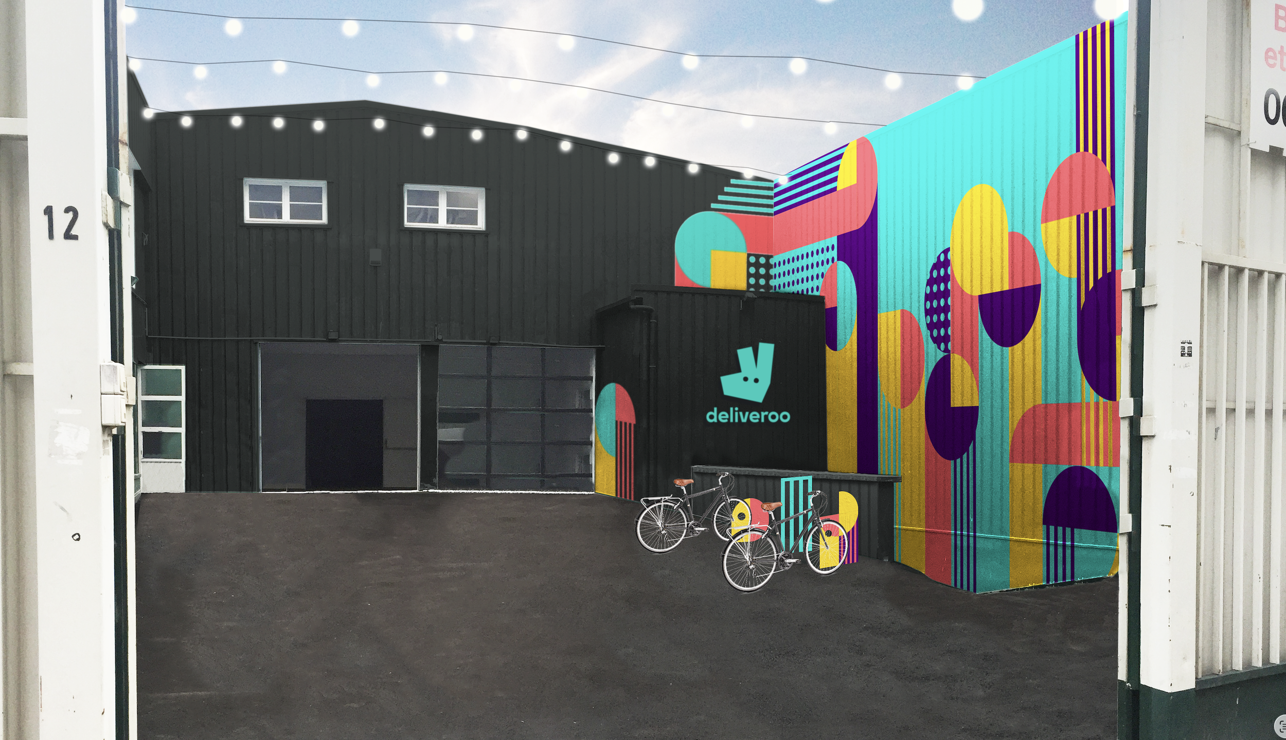
Editions was Deliveroo’s first major sub-brand: a network of delivery-only restaurant sites designed around fighting food envy by expanding into neighbourhoods that lacked choice.
The internal name, Roo Box, described the function while Editions captured our ambition: curated restaurant collections shaped around local taste, demand and discovery.
Identity
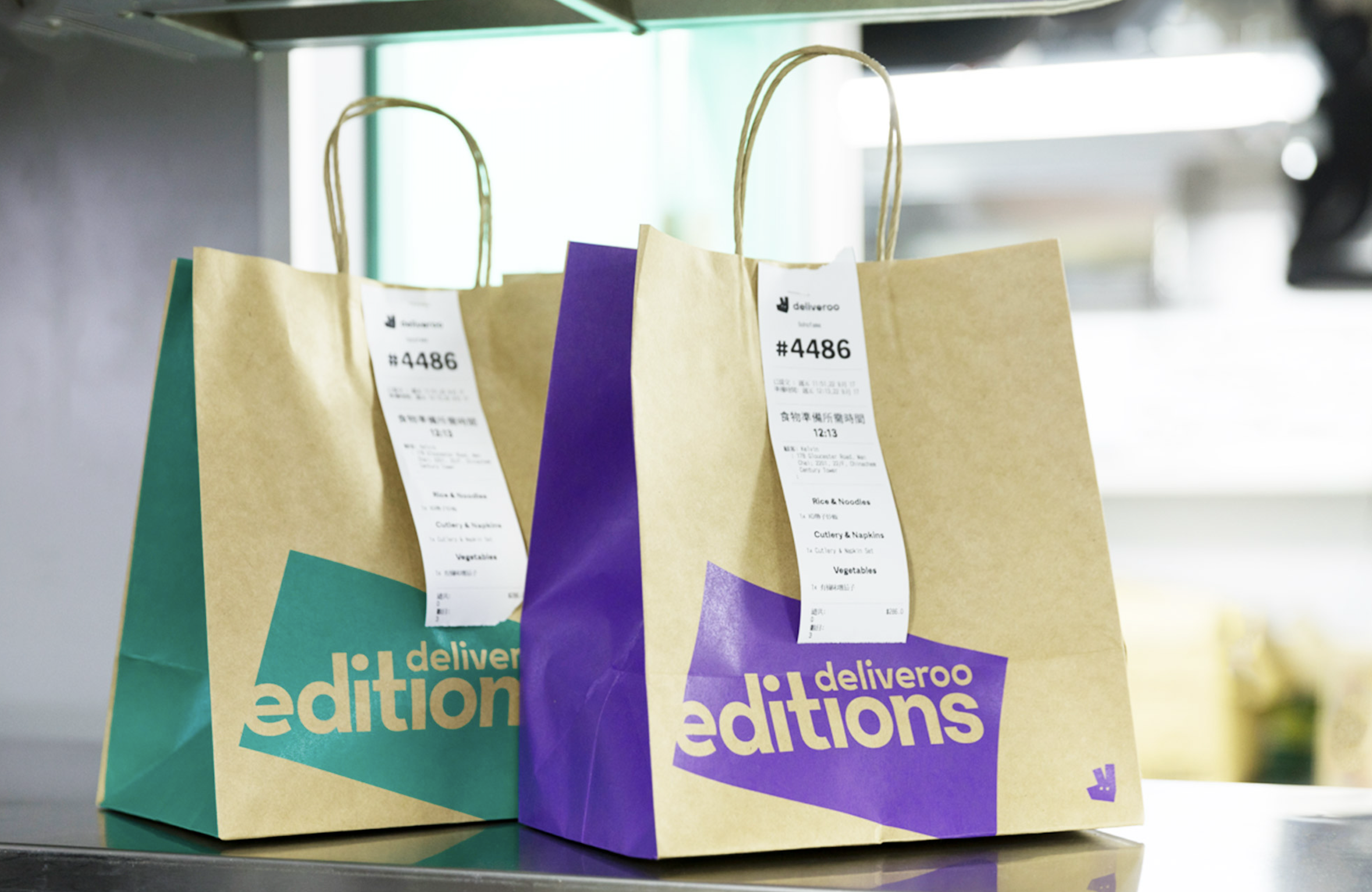
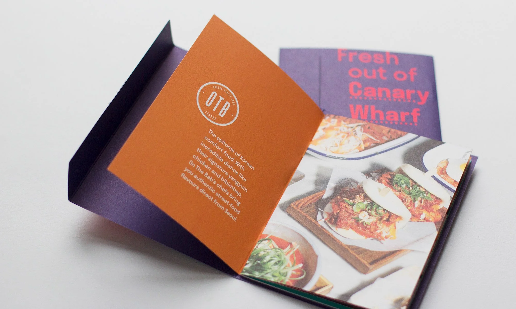
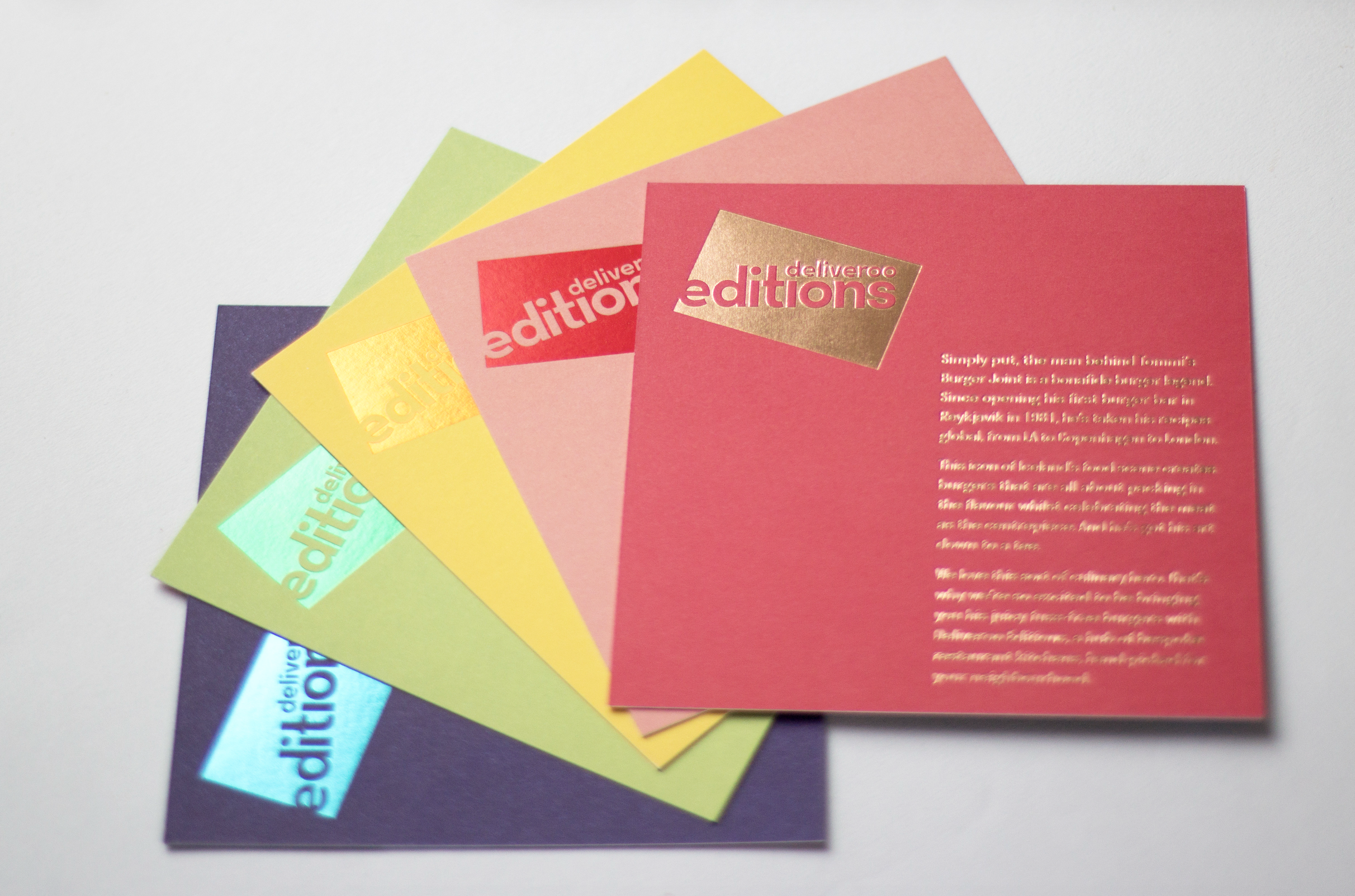
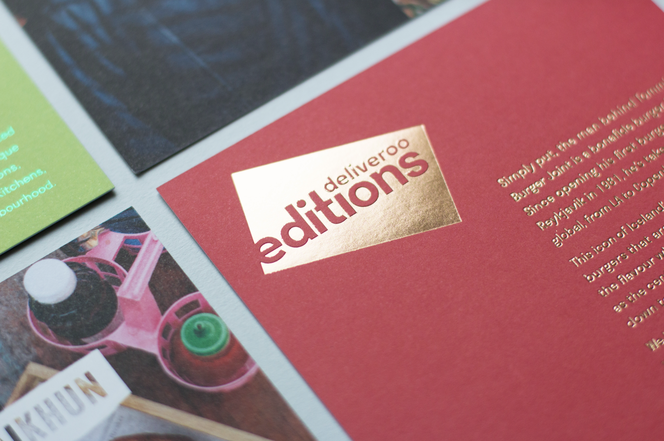
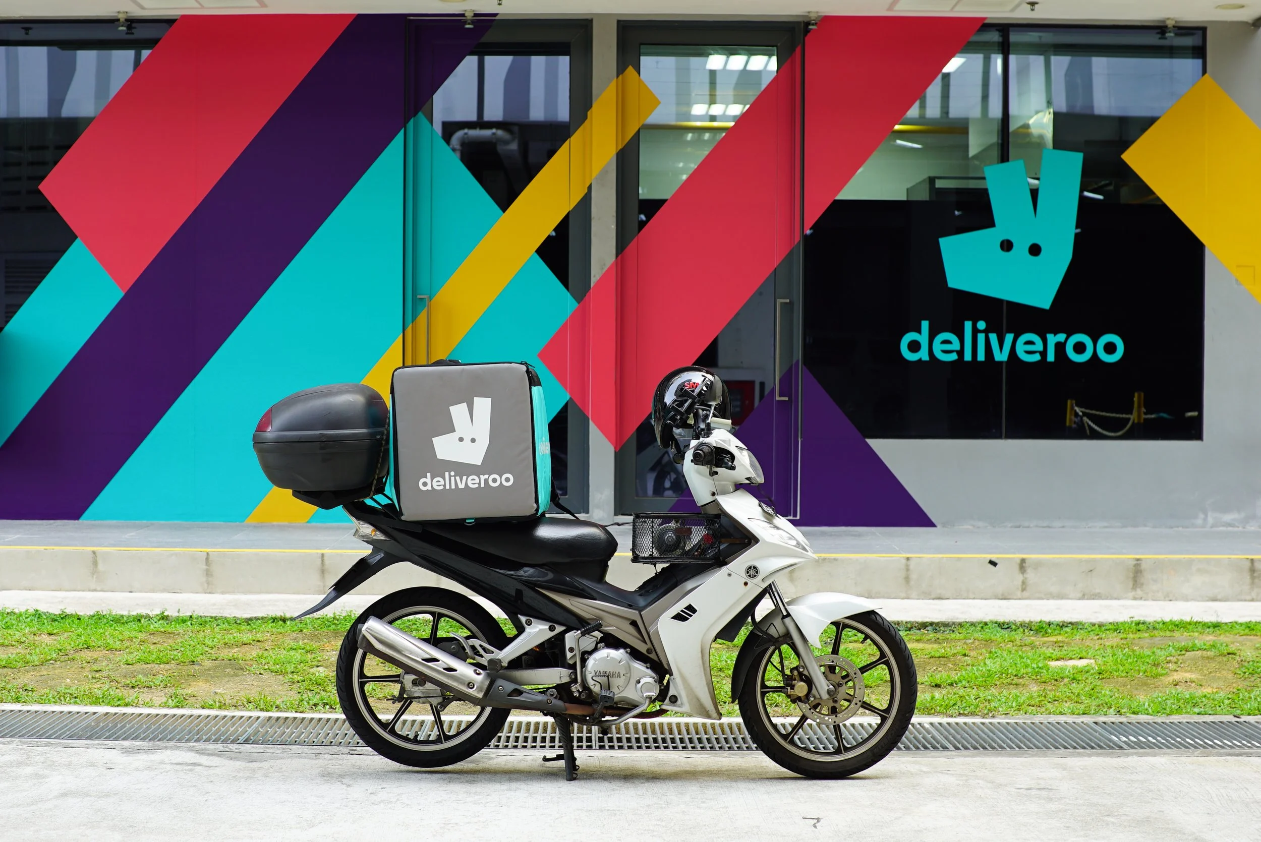
The identity needed to feel connected to Deliveroo, but distinct enough to stand alone. The stamp-style logo used the core wordmark inside a container shape which nodded to the original ‘box’ idea and the angular Roo mark, making it simple enough to sit beside Deliveroo and the restaurant brands we partnered with.
Launch system
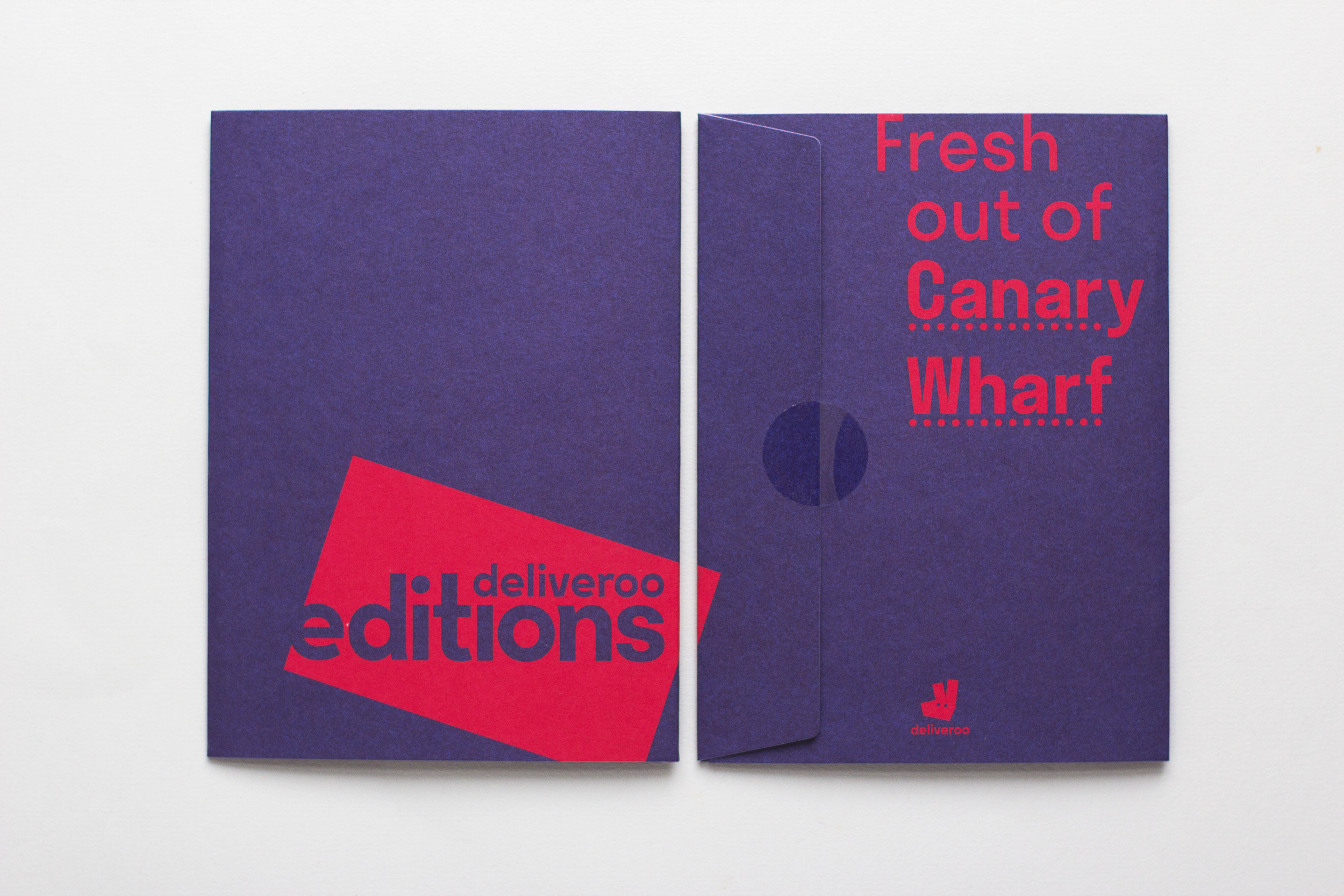
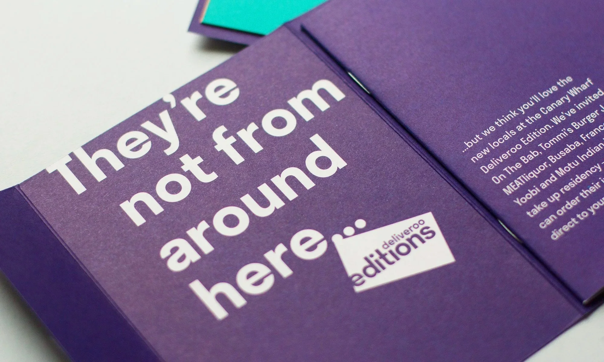
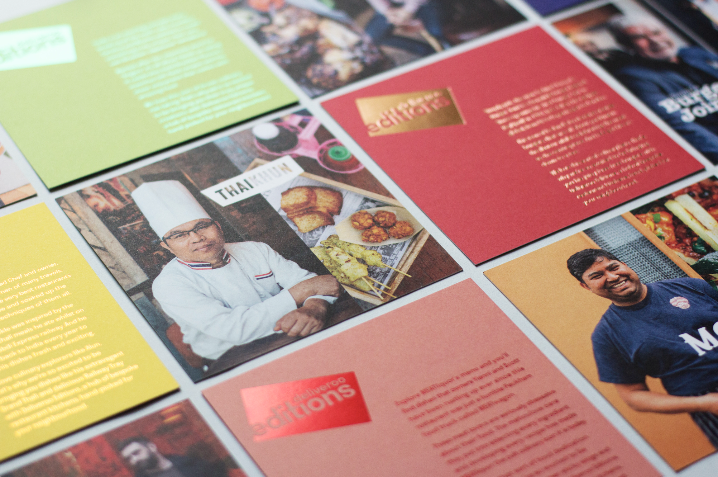
Every Editions site was different, but the launch process needed structure. I created adaptable launch assets, templates and guidance for print, email, social, brand application and photography, giving local teams consistency without making every launch feel copied and pasted.
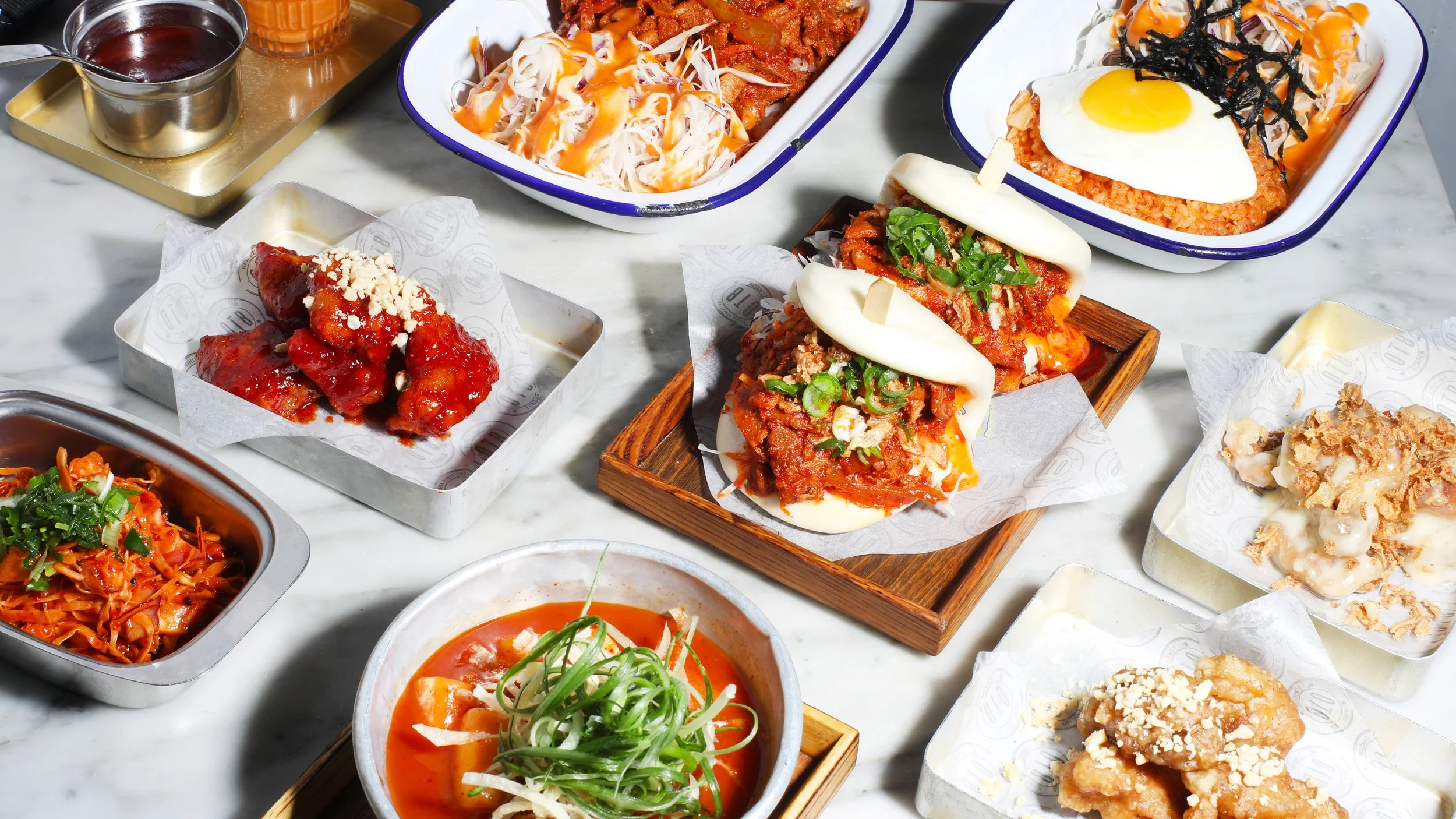
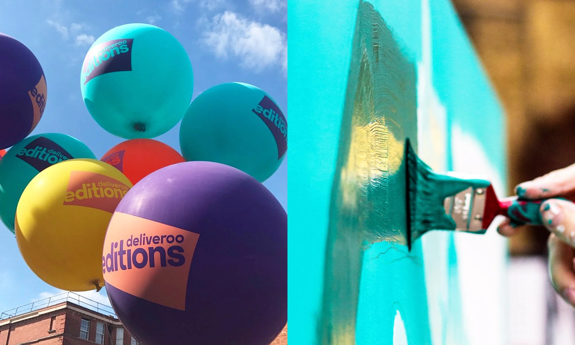
Launch merch and socials

Photography – Generic

Photographer Credit: Scott Grummett
Print materials – DMs and Flyers
Photography – Restaurant specific
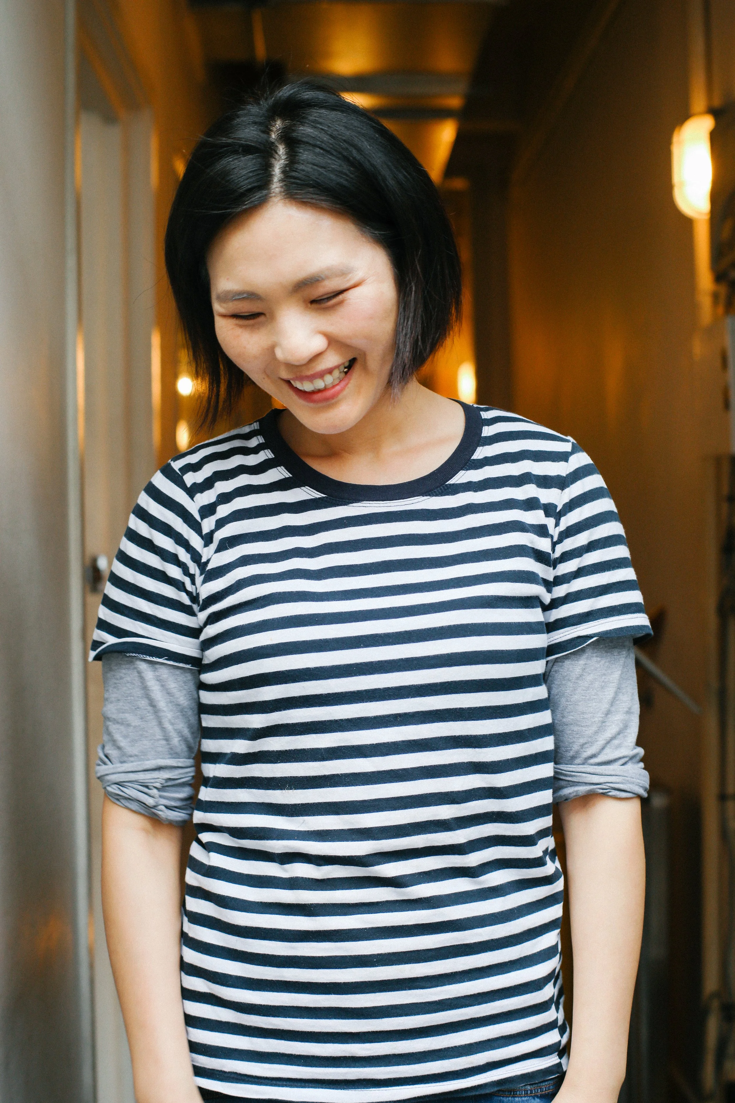
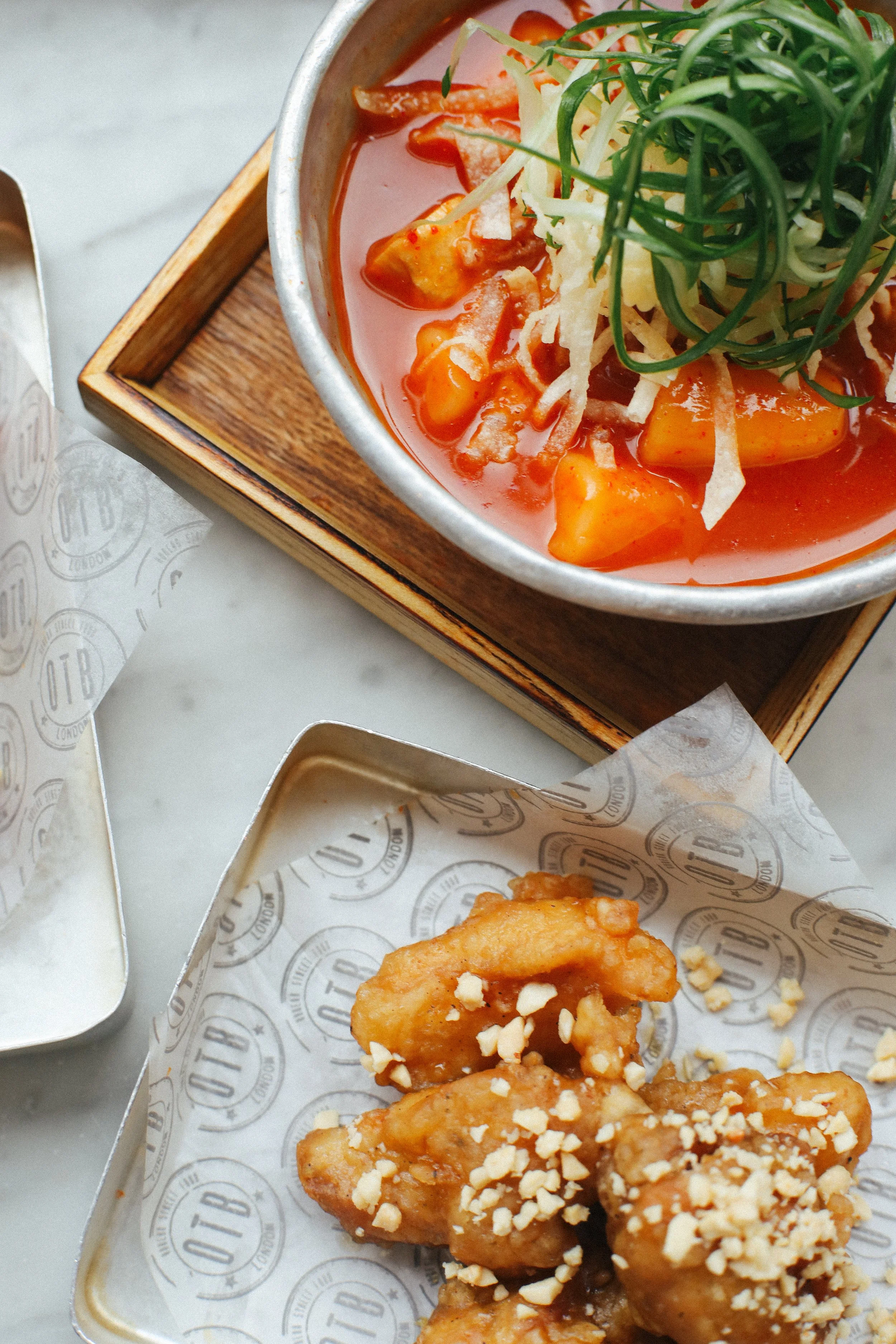
Photographer credit: Felicity Millward, On The Bab
Sites and local adaptation
I designed sites in over seven countries, from a doorway in Hong Kong to murals in Paris, shutters in Singapore and shipping containers in London.
Each site had its own constraints. The job was to keep the brand recognisable while making the work feel specific to the place.
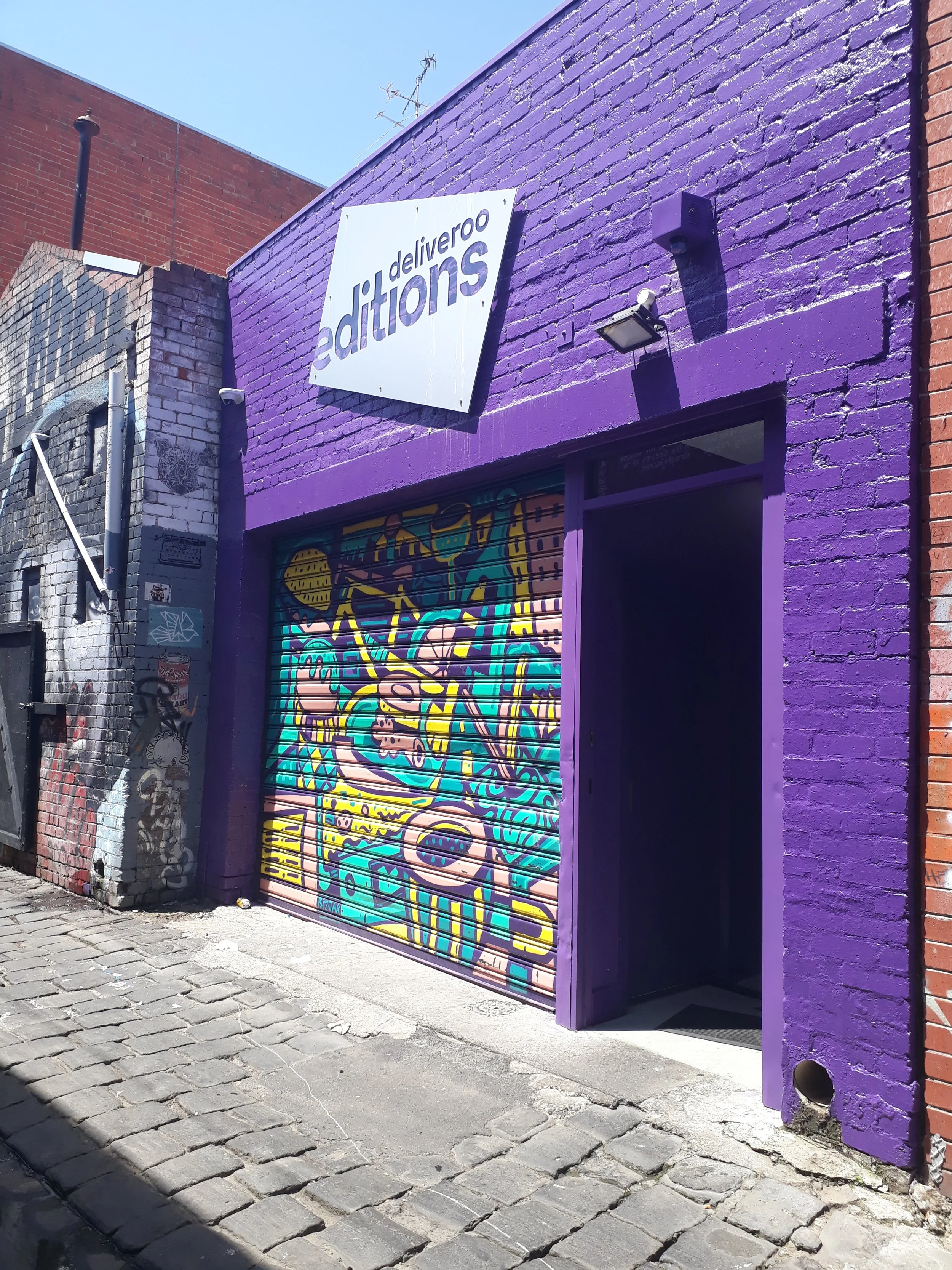
Aerosol Alley – Melbourne, Australia (Artwork by Conrad Bizjak)

Site concept and final mural – Paris

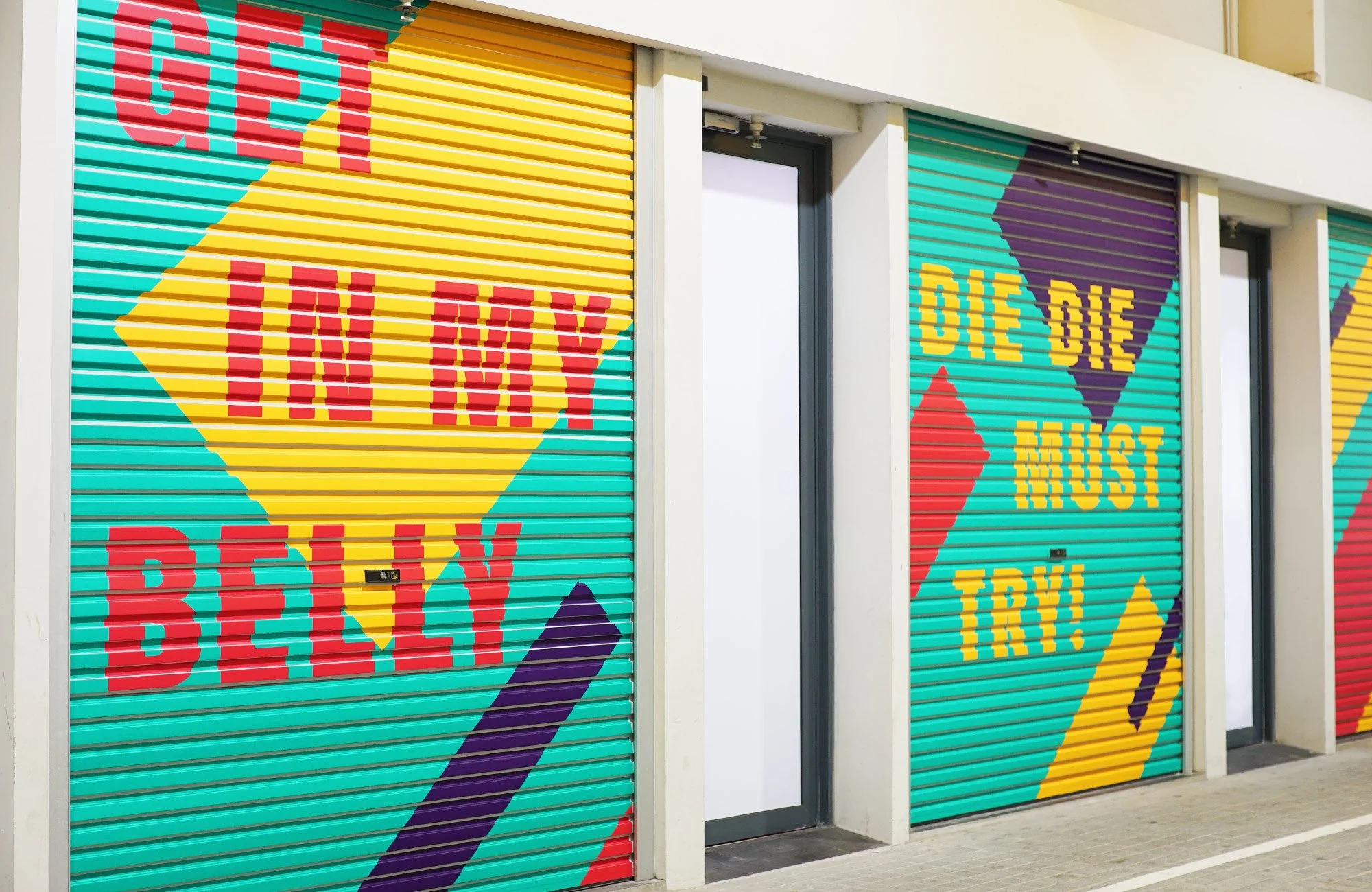
“The first thing that surprised us was the warehouse aesthetic. Vibrantly-coloured shutters serving as external walls, with some bearing Deliveroo and Deliveroo Editions logos, offer a welcoming sight to visitors.”
“Some shutters are playfully adorned with Singlish phrases such as “Makan time!” and “Die die must try!”, radiating a strong local flavour accompanied with an overall minimalist look.
With the opposite facade bearing an equally striking design, not finding the location on your own is close to impossible.”
– Business Insider, Singapore

Singapore Editions Site

Hong Kong Editions Site
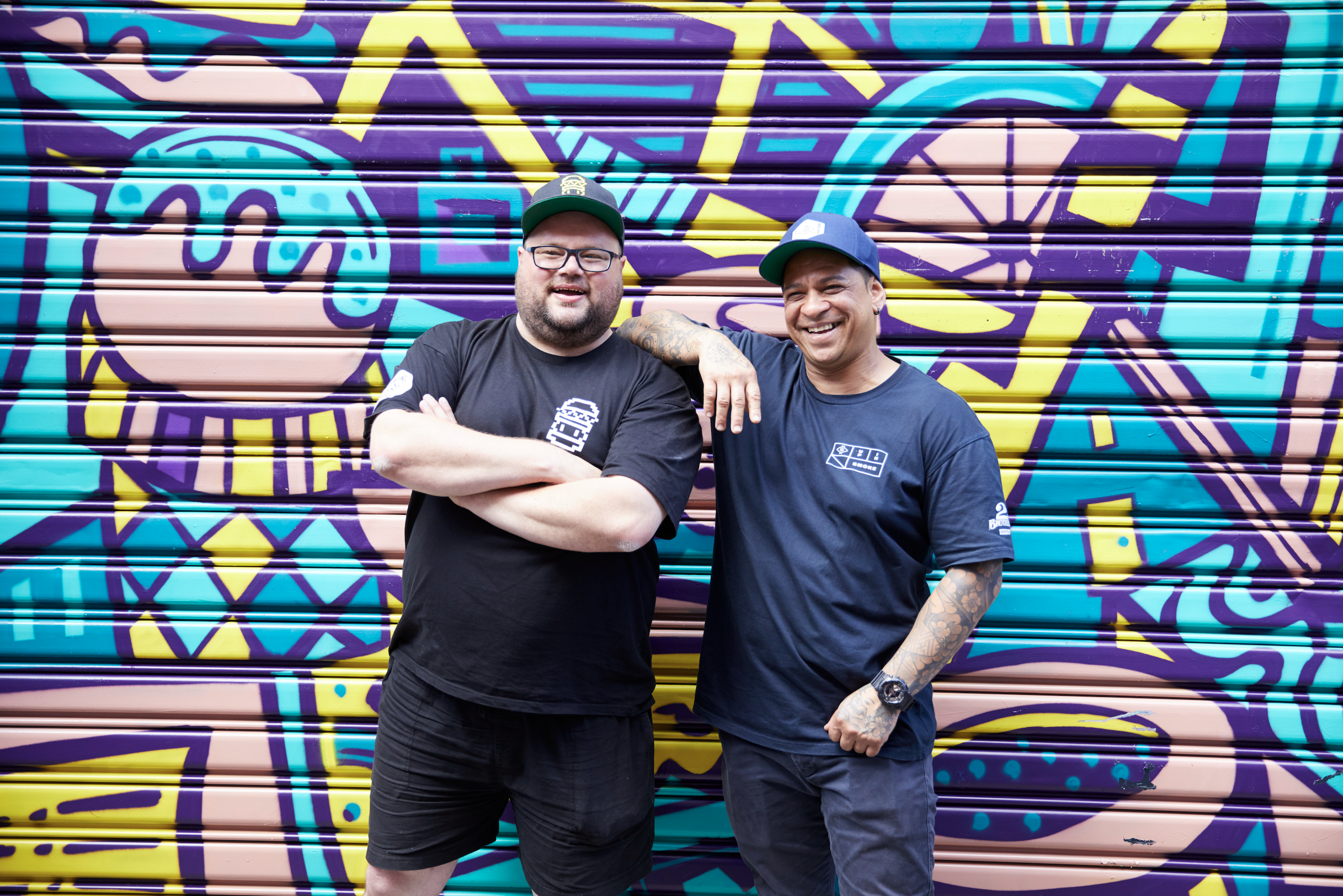
Events and collaborations
We worked with local artists, restaurant owners, agencies and public spaces to make launches feel rooted in their neighbourhoods.
This included PR and experiential concepts like Feast on Film, an outdoor cinema event in Hove with local Editions restaurants on the tasting terrace.

Local illustrator Launch DMs – UK

Feast on Film PR Event – Brighton

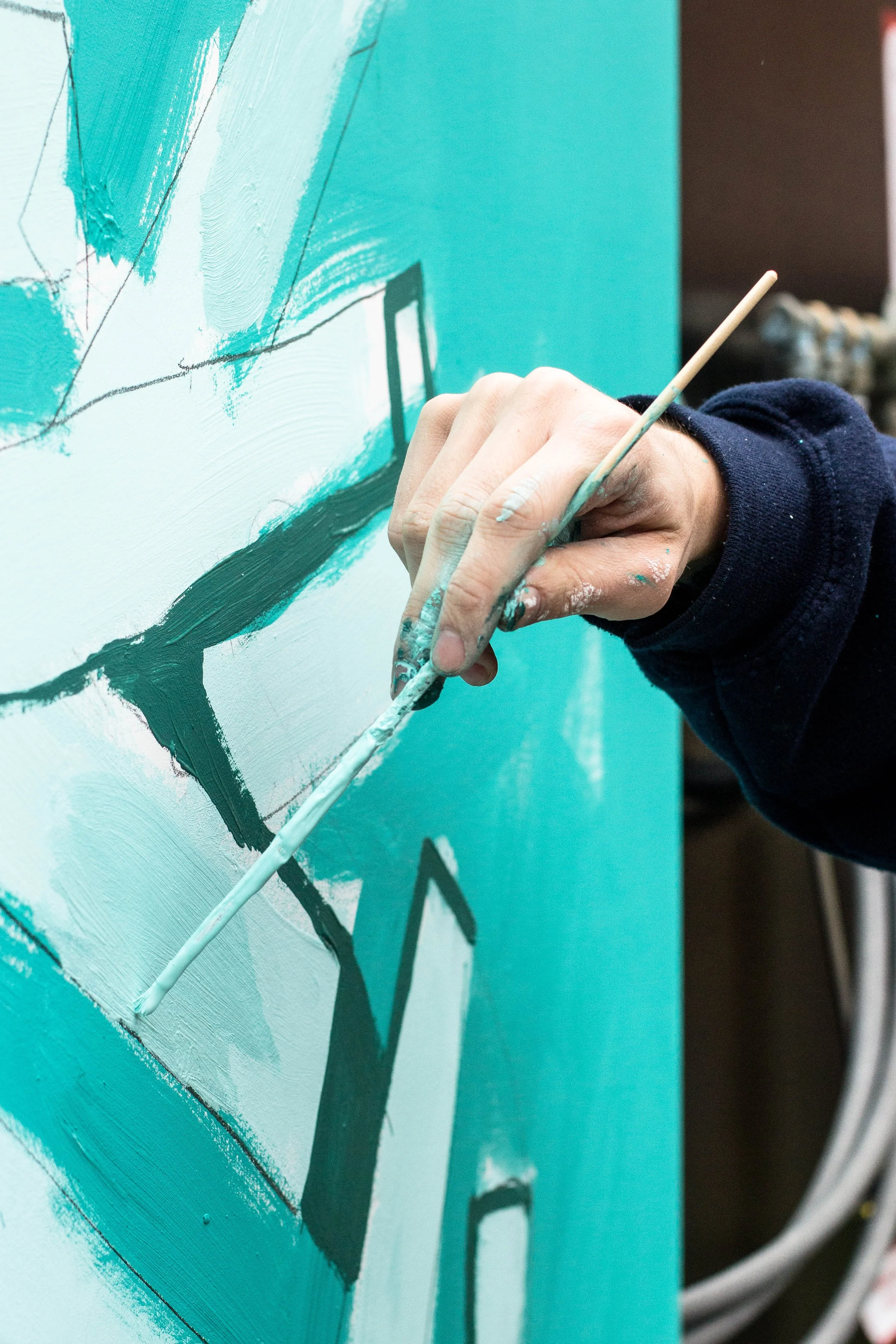
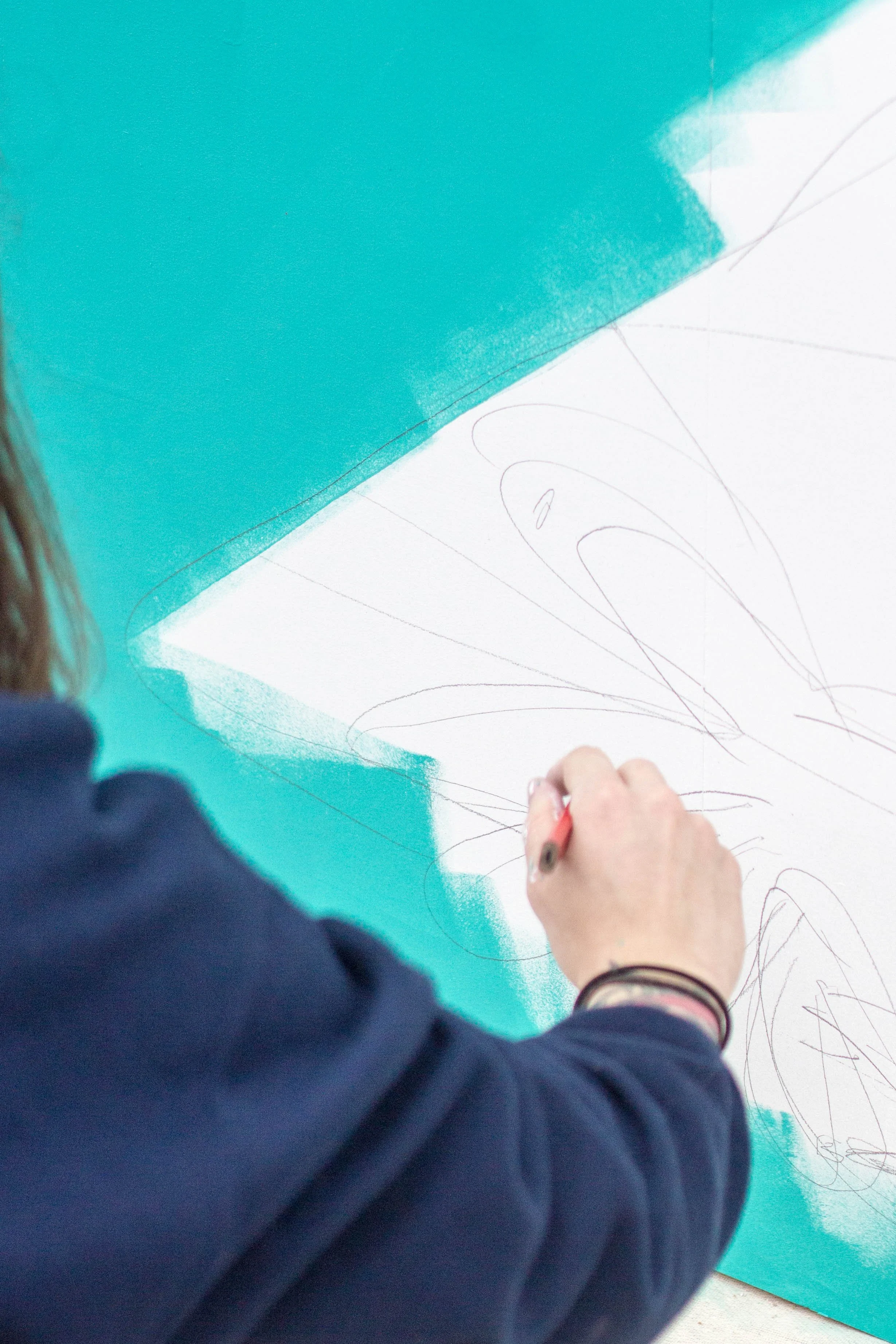
Live mural painting – London